;%20}%20%3c/style%3e%3clinearGradient%20id='linear-gradient'%20x1='941.3'%20y1='-128'%20x2='257.3'%20y2='550'%20gradientTransform='translate(698.7%20-291.6)%20rotate(135)%20scale(1%20-1)'%20gradientUnits='userSpaceOnUse'%3e%3cstop%20offset='0'%20stop-color='%23fff'/%3e%3cstop%20offset='1'%20stop-color='%23000'/%3e%3c/linearGradient%3e%3c/defs%3e%3c!--%20Generator:%20Adobe%20Illustrator%2028.7.1,%20SVG%20Export%20Plug-In%20.%20SVG%20Version:%201.2.0%20Build%20142)%20--%3e%3cg%3e%3cg%20id='Layer_1'%3e%3cg%20id='Layer_2'%3e%3cg%20id='Layer_1-2'%3e%3cpath%20class='cls-1'%20d='M455.2,563.9L0,108.7,108.7,0l346.6,346.6L801.8,0l108.7,108.7-455.2,455.2Z'/%3e%3c/g%3e%3c/g%3e%3c/g%3e%3c/g%3e%3c/svg%3e)
Lakra
Freelance · Frontend Developer · UI/UX Designer · Motion Graphics Designer · Brand Designer · No AI Involvement · 2020
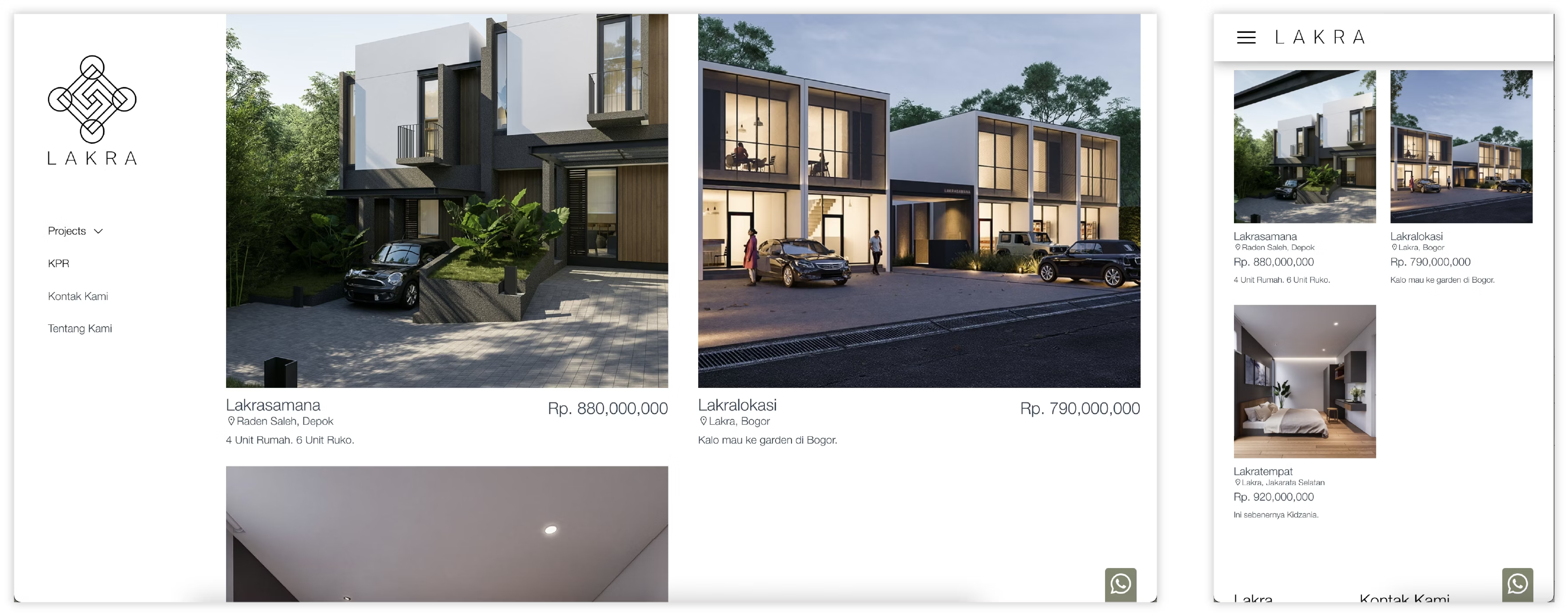
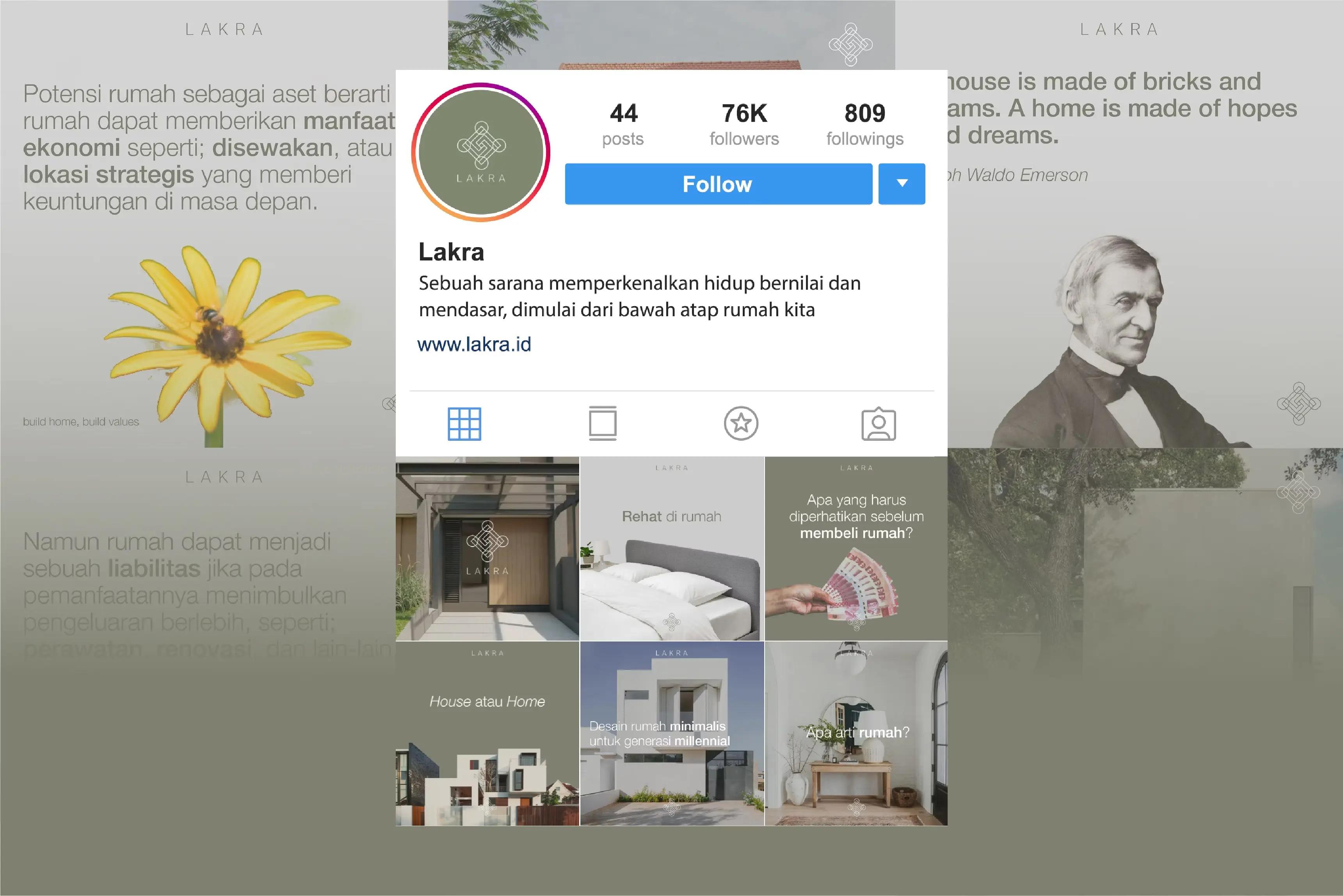
Lakra is a property developer company based in Jakarta, Lakra provides innovative and quality premium housing for clients. Client is our priority in all aspects of development. Build home, build values. This project involves a 3-man team each contributing in branding, marketing, social media planning, UI/UX, and web development.
Logo
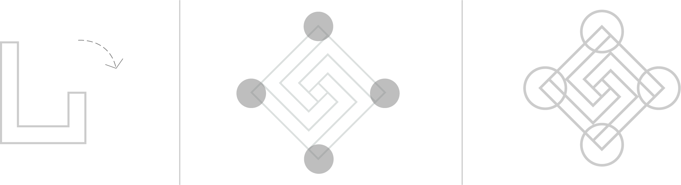
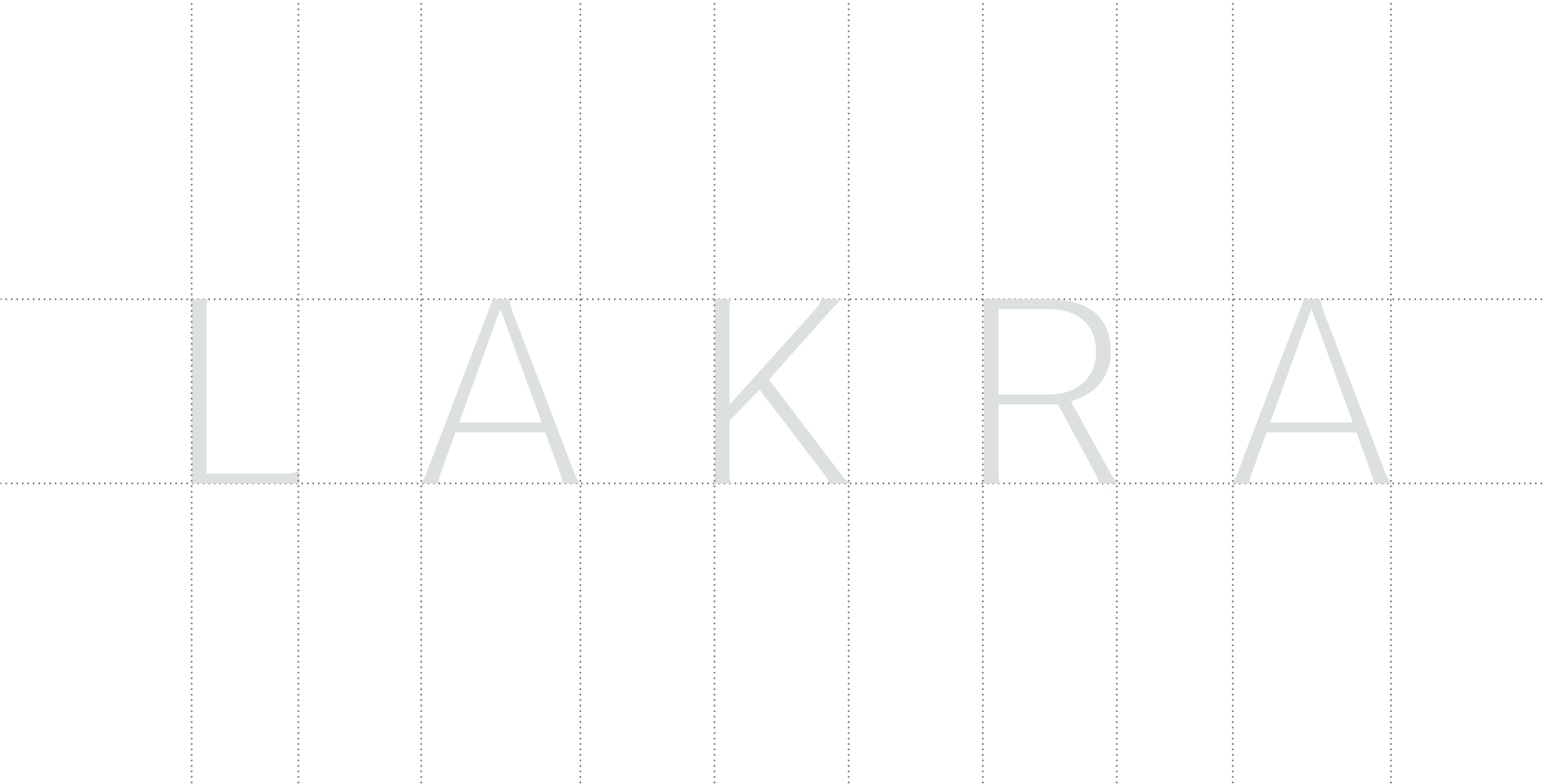
Lakra’s logo was taken from the silhouette of L, which has been rotated and unified into a form of a 45° angled box, which signifies unity and order. The 4 edges of the box are softened with the presence of circular elements on each edge. This graphic logo represents Lakra as corporate identity, and won’t be used in the housing area of each Lakra(s). Lakra’s logotype represents minimalism and elegance. The logo uses wider spacing to create more negative spaces and curved edges to show attention to detail.

Typography
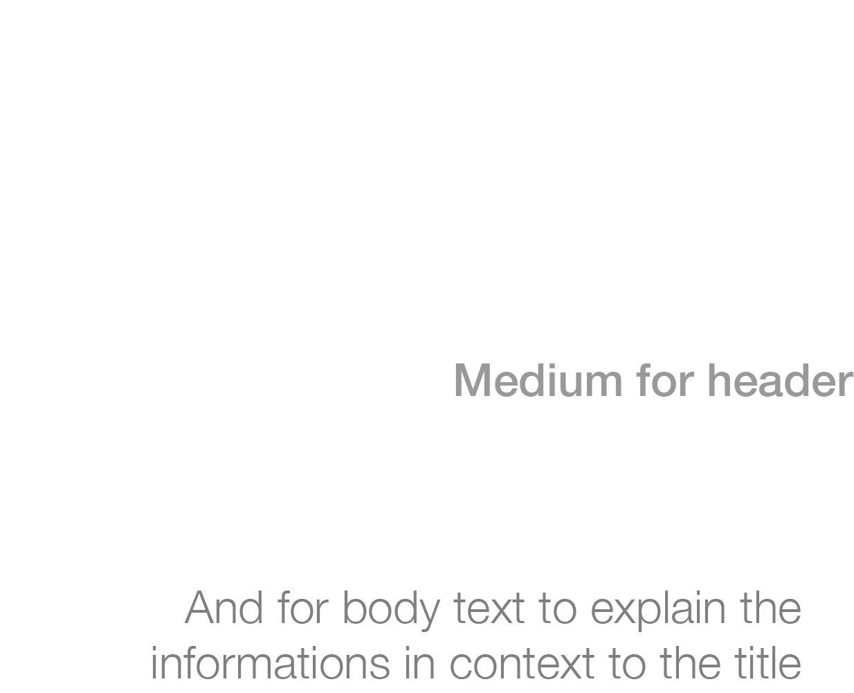
Our typeface is simple and universal, it allows us to communicate clearly and truthfully. For main texts and titles, we use Helvetica Neue Light, Helvetica Neue Medium for the header, and another Helvetica Neue Light for body texts.
Color
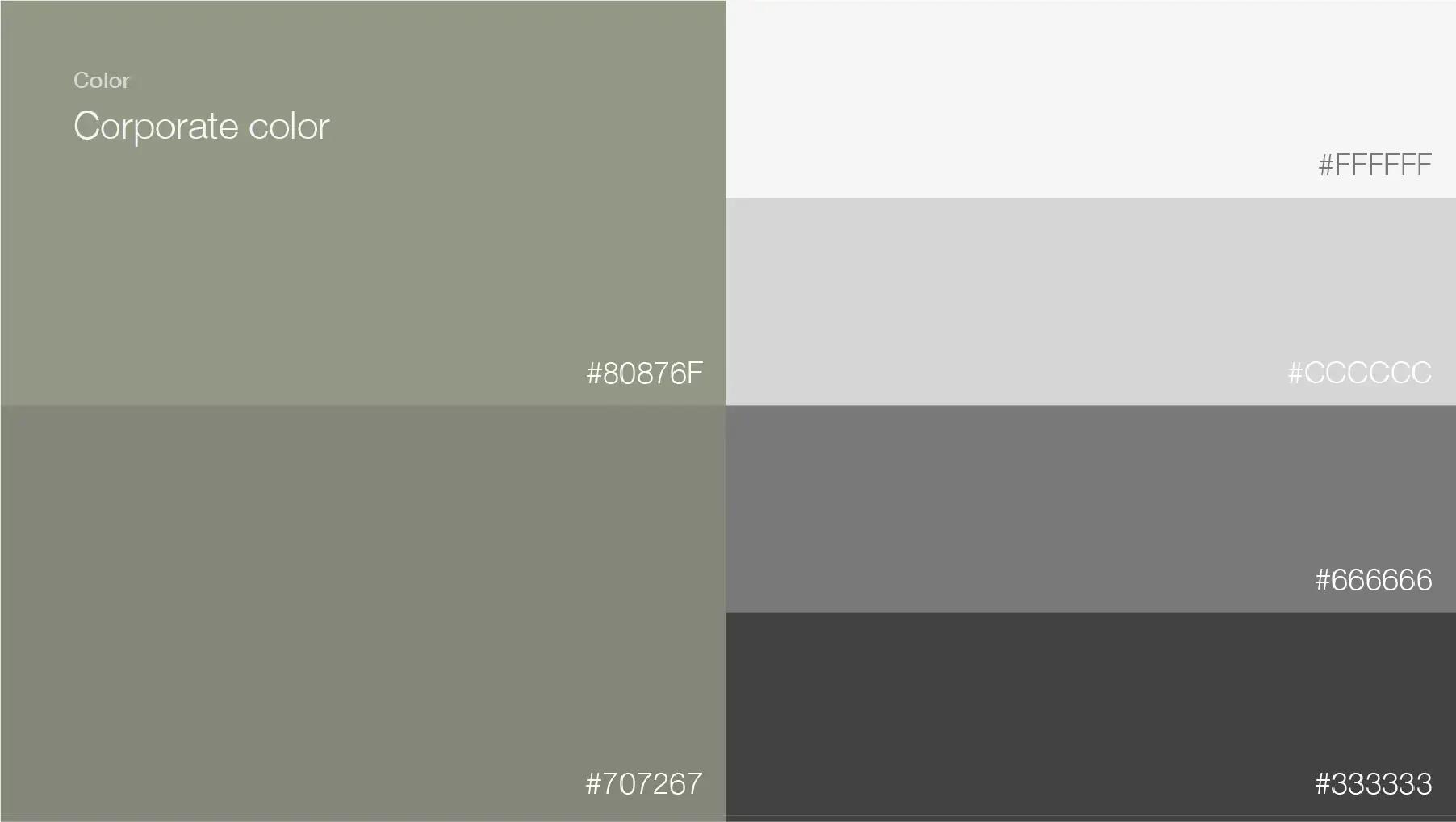
Lakra’s color should be earthy and natural. Thus the different colors of green and monochrome shades for contrast.
Illustrations
Video Reel
Social Media
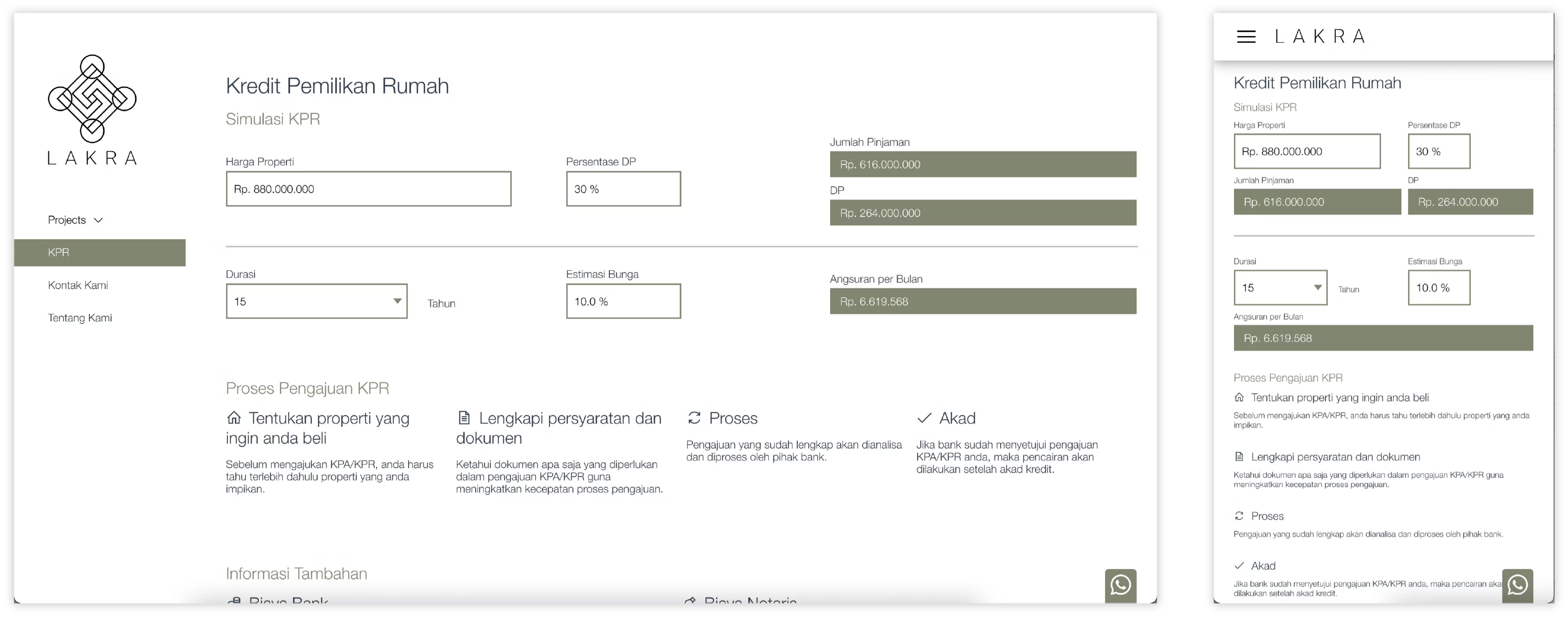
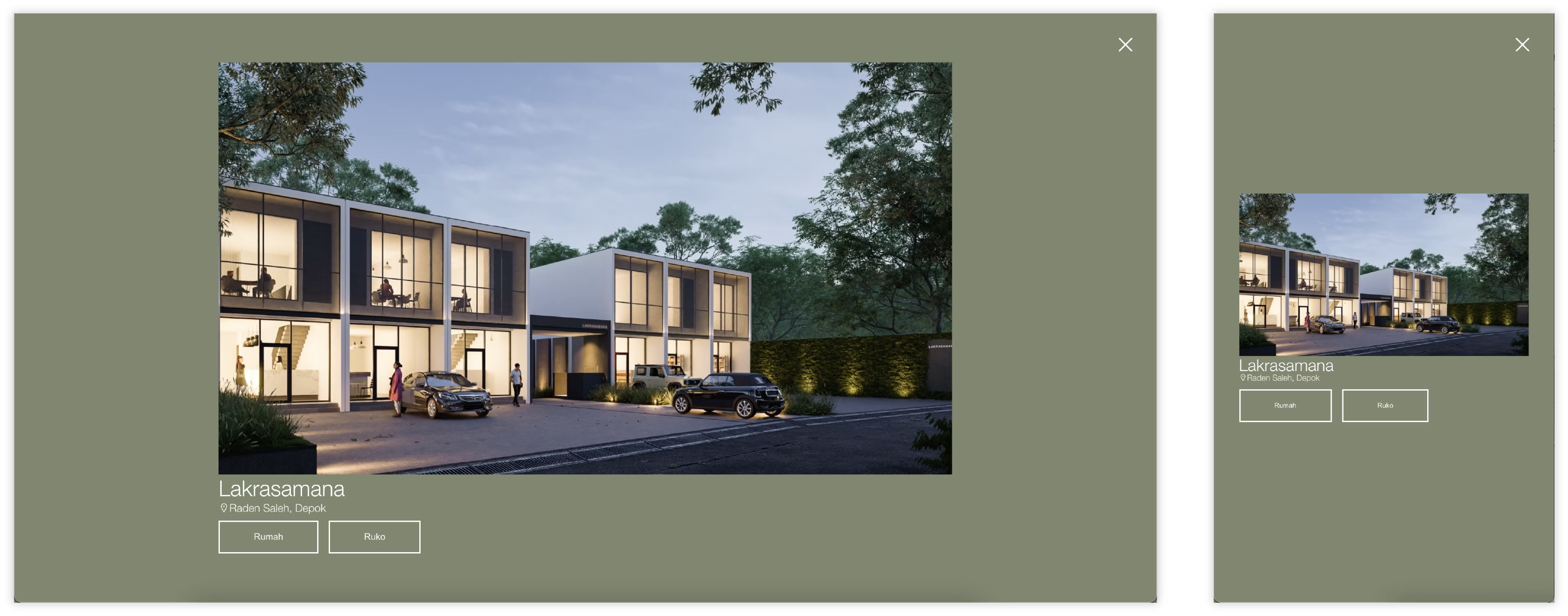
Website